- This topic is empty.
-
AuthorPosts
-
November 28, 2017 at 2:51 am #9063
David Hoang
KeymasterIn the HTML file:
<input type="text" placeholder="placeholder" class="redPlaceHolder" />In the CSS file:
.redPlaceHolder {
   color: #ff0000;
}
December 20, 2017 at 6:32 am #9080KeymasterYou can change an HTML5 input’s placeholder color with CSS. If by chance, your CSS conflict, this code note working , you can use (!important) like below.
::-webkit-input-placeholder { /* WebKit, Blink, Edge */
    color:#909 !important;
}
:-moz-placeholder { /* Mozilla Firefox 4 to 18 */
   color:#909 !important;
   opacity:1 !important;
}
::-moz-placeholder { /* Mozilla Firefox 19+ */
   color:#909 !important;
   opacity:1 !important;
}
:-ms-input-placeholder { /* Internet Explorer 10-11 */
   color:#909 !important;
}
::-ms-input-placeholder { /* Microsoft Edge */
   color:#909 !important;
}

<input placeholder="Stack Snippets are awesome!">
Hope this will help.
December 20, 2017 at 10:00 am #9075KeymasterYou can use this for input and focus style:
input::-webkit-input-placeholder  { color:#666;}
input:-moz-placeholder  { color:#666;}
input::-moz-placeholder { color:#666;}
input:-ms-input-placeholder  { color:#666;}
/* focus */
input:focus::-webkit-input-placeholder { color:#eee; }
input:focus:-moz-placeholder { color:#eee } /* FF 4-18 */
input:focus::-moz-placeholder { color:#eee } /* FF 19+ */
input:focus:-ms-input-placeholder { color:#eee } /* IE 10+ */
April 1, 2018 at 5:04 am #9084KeymasterAdding an actual very nice and simple possibility: CSS filters!

It will style everything, including the placeholder.
The following will set both
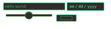
inputelements on the same palette, using the hue filter for color changes. It render very well now in browsers (except ie…)input { filter: sepia(100%) saturate(400%) grayscale(0) contrast(200%) hue-rotate(68deg) invert(18%); }<input placeholder="Hello world!" /> <input type="date" /><br> <input type="range" /> <input type="color" />To allow users to change it dynamically, using an input type color for changes, or to find nuances, check out this snippet:
From: Codepen
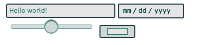
function stylElem() {
  stylo.dataset.hue = ((parseInt(stylo.value.substring(1), 16))/46666).toFixed(0)
  Array.from(document.querySelectorAll('input, audio, video')).forEach(function(e){
      e.style.cssText += ";filter:sepia(100%) saturate(400%)grayscale(0)contrast(200%)hue-rotate("+ stylo.dataset.hue+"deg)invert("+(stylo.dataset.hue/3.6)+"%)"
  out.innerText = e.style.cssText
})()}

stylElem()
body {background: black; color: white}Choose a color! <input type="color" id="stylo" oninput="stylElem()"> <br> <div id="out"></div> <p> <input placeholder="Hello world!" /> <input type="date" /><br> <input type="range" /> <br> <audio controls src="#"></audio> <br><br> <video controls src="#"></video>Css filters docs: https://developer.mozilla.org/en-US/docs/Web/CSS/filter
October 28, 2018 at 3:41 am #9076KeymasterThe easiest way would be:
#yourInput::placeholder {
    color: red;/*As an example*/
}
/* if that would not work, you can always try styling the attribute itself: */
#myInput[placeholder] {
    color: red;
}
November 19, 2018 at 11:49 am #9062KeymasterPlaceholder color on specific element in different browsers.
.contact::-webkit-input-placeholder {
    /* Chrome/Opera/Safari */
    color: pink;
}
.contact::-moz-placeholder {
    /* Firefox 19+ */
    color: pink;
}
.contact:-ms-input-placeholder {
    /* IE 10+ */
    color: pink;
}
.contact:-moz-placeholder {
    /* Firefox 18- */
    color: pink;
}
<input class="contact" type="email" placeholder="[email protected]" />July 18, 2019 at 10:35 am #9071KeymasterA part of HTML:
<form action="www.anything.com">
    <input type="text" name="name" placeholder="Enter sentence" />
</form>
I gonna show how to change the color of the expression ‘Enter sentence’ by CSS:
::placeholder {
    color: blue;
}
September 4, 2019 at 1:09 am #9074KeymasterHere is the solution with CSS selectors
::-webkit-input-placeholder { /* WebKit, Blink, Edge */
    color:    #909;
}
:-moz-placeholder { /* Mozilla Firefox 4 to 18 */ color: #909; opacity: 1; }::-moz-placeholder { /* Mozilla Firefox 19+ */ color: #909; opacity: 1; }::-ms-input-placeholder { /* Microsoft Edge */ color: #909; }:-ms-input-placeholder { /* Internet Explorer 10-11 */ color: #909; }- WebKit, Blink (Safari, Google Chrome, Opera 15+) and Microsoft Edge are using a pseudo-element:
::-webkit-input-placeholder. - Mozilla Firefox 4 to 18 is using a pseudo-class:
:-moz-placeholder (one colon).
Mozilla Firefox 19+ is using a pseudo-element:
::-moz-placeholder, but the old selector will still work for a while. - Internet Explorer 10 and 11 are using a pseudo-class:
:-ms-input-placeholder. - Internet Explorer 9 and lower does not support the placeholder attribute at all, while Opera 12 and lower do not support any CSS selector for placeholders.
December 11, 2019 at 7:51 am #9064KeymasterThis code will change the color of the placeholder using the
::placeholderselector.::-webkit-input-placeholder { /* Edge */ color: red; } :-ms-input-placeholder { /* Internet Explorer */ color: red; } ::placeholder { color: red; }September 22, 2020 at 2:32 am #9065Keymaster.input-control::placeholder { /* Chrome, Firefox, Opera, Safari 10.1+ */ color: red !important; opacity: 1; /* Firefox */ } .input-control:-ms-input-placeholder { /* Internet Explorer 10-11 */ color: red !important; } .input-control::-ms-input-placeholder { /* Microsoft Edge */ color: red !important; }<input type="text" class="input-control" placeholder="My Input" />Check this reference to learn more.
January 23, 2021 at 11:01 am #9070KeymasterTry this:
input::placeholder {
   color: #900009;
}
August 16, 2021 at 2:06 am #9067KeymasterUse this code it works for all browsers.
CSS:
::placeholder {
   color: #ccc;
}
HTML:
<input class="form-control" placeholder="write Here.." />September 1, 2021 at 11:11 am #9078Keymaster::placeholder{ color: red; }<input type="text" placeholder="Value">October 8, 2021 at 11:21 am #9081KeymasterThis is fine for most of the modern browsers
input::placeholder{
  color: red; // css implementation
}
Just in case if you are using SCSS
input {
  &::placeholder {
    color: red; // scss
  }
}
February 27, 2022 at 1:35 am #9068Keymasterinput::placeholder { color: red; }<input type="text" placeholder="value" /> - WebKit, Blink (Safari, Google Chrome, Opera 15+) and Microsoft Edge are using a pseudo-element:
-
AuthorPosts
- You must be logged in to reply to this topic.