- This topic is empty.
-
AuthorPosts
-
September 26, 2013 at 11:22 am #9428
bsr
ParticipantHow to center div horizontally, and vertically within the container using flexbox. In below example, I want each number below each other (in rows), which are centered horizontally.
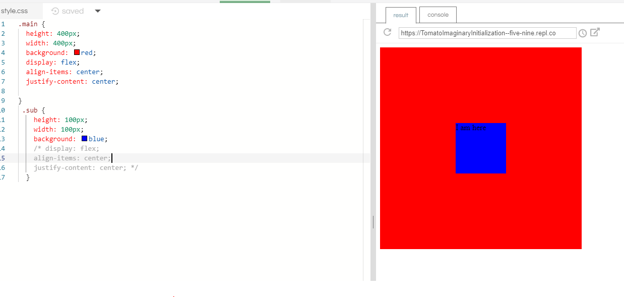
.flex-container {
  padding: 0;
  margin: 0;
  list-style: none;
  display: flex;
  align-items: center;
  justify-content: center;
}
row {
  width: 100%;
}
.flex-item {
  background: tomato;
  padding: 5px;
  width: 200px;
  height: 150px;
  margin: 10px;
  line-height: 150px;
  color: white;
  font-weight: bold;
  font-size: 3em;
  text-align: center;
}
<div class="flex-container"> <div class="row"> <span class="flex-item">1</span> </div> <div class="row"> <span class="flex-item">2</span> </div> <div class="row"> <span class="flex-item">3</span> </div> <div class="row"> <span class="flex-item">4</span> </div> </div>September 26, 2013 at 12:13 pm #9442marc-audet
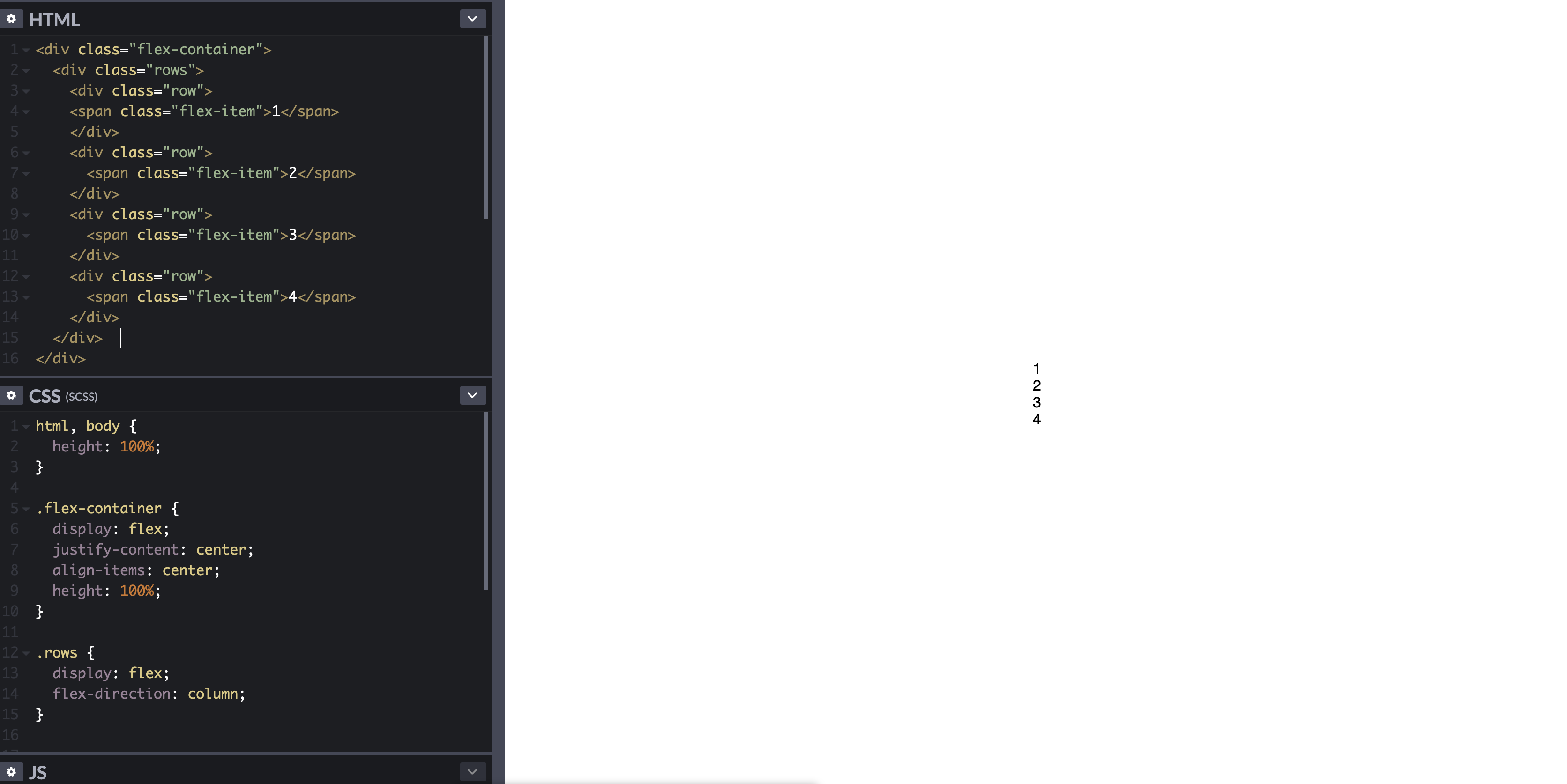
ParticipantI think you want something like the following.
html, body {
    height: 100%;
}
body {
    margin: 0;
}
.flex-container {
    height: 100%;
    padding: 0;
    margin: 0;
    display: flex;
    align-items: center;
    justify-content: center;
}
.row {
    width: auto;
    border: 1px solid blue;
}
.flex-item {
    background-color: tomato;
    padding: 5px;
    width: 20px;
    height: 20px;
    margin: 10px;
    line-height: 20px;
    color: white;
    font-weight: bold;
    font-size: 2em;
    text-align: center;
}
<div class="flex-container"> <div class="row"> <div class="flex-item">1</div> <div class="flex-item">2</div> <div class="flex-item">3</div> <div class="flex-item">4</div> </div> </div>See demo at: http://jsfiddle.net/audetwebdesign/tFscL/
Your
.flex-itemelements should be block level (divinstead ofspan) if you want the height and top/bottom padding to work properly.Also, on
.row, set the width toautoinstead of100%.Your
.flex-containerproperties are fine.If you want the
.rowto be centered vertically in the view port, assign 100% height tohtmlandbody, and also zero out thebodymargins.Note that
.flex-containerneeds a height to see the vertical alignment effect, otherwise, the container computes the minimum height needed to enclose the content, which is less than the view port height in this example.Footnote:
Theflex-flow,flex-direction,flex-wrapproperties could have made this design easier to implement. I think that the.rowcontainer is not needed unless you want to add some styling around the elements (background image, borders and so on).A useful resource is: http://demo.agektmr.com/flexbox/
June 14, 2014 at 12:02 pm #9438qmaster
ParticipantDon’t forgot to use important browsers specific attributes:
align-items: center; –>
-webkit-box-align: center;
-moz-box-align: center;
-ms-flex-align: center;
-webkit-align-items: center;
align-items: center;
justify-content: center; –>
-webkit-box-pack: center;
-moz-box-pack: center;
-ms-flex-pack: center;
-webkit-justify-content: center;
justify-content: center;
You could read this two links for better understanding flex:
http://css-tricks.com/almanac/properties/j/justify-content/ and
http://ptb2.me/flexbox/Good Luck.
October 10, 2015 at 1:06 am #9441michael-benjamin
ParticipantHow to Center Elements Vertically and Horizontally in Flexbox
Below are two general centering solutions.
One for vertically-aligned flex items (
flex-direction: column) and the other for horizontally-aligned flex items (flex-direction: row).In both cases the height of the centered divs can be variable, undefined, unknown, whatever. The height of the centered divs doesn’t matter.
Here’s the HTML for both:
<div id="container"><!-- flex container -->

    <div class="box" id="bluebox"><!-- flex item -->
        <p>DIV #1</p>
    </div>

    <div class="box" id="redbox"><!-- flex item -->
        <p>DIV #2</p>
    </div>

</div>
CSS (excluding decorative styles)
When flex items are stacked vertically:
#container {
    display: flex;           /* establish flex container */
    flex-direction: column;  /* make main axis vertical */
    justify-content: center; /* center items vertically, in this case */
    align-items: center;     /* center items horizontally, in this case */
    height: 300px;
}

.box {
    width: 300px;
    margin: 5px;
    text-align: center;     /* will center text in <p>, which is not a flex item */
}
When flex items are stacked horizontally:
Adjust the
flex-directionrule from the code above.#container { display: flex; flex-direction: row; /* make main axis horizontal (default setting) */ justify-content: center; /* center items horizontally, in this case */ align-items: center; /* center items vertically, in this case */ height: 300px; }
Centering the content of the flex items
The scope of a flex formatting context is limited to a parent-child relationship. Descendants of a flex container beyond the children do not participate in flex layout and will ignore flex properties. Essentially, flex properties are not inheritable beyond the children.
Hence, you will always need to apply
display: flexordisplay: inline-flexto a parent element in order to apply flex properties to the child.In order to vertically and/or horizontally center text or other content contained in a flex item, make the item a (nested) flex container, and repeat the centering rules.
.box {
    display: flex;
    justify-content: center;
    align-items: center;        /* for single line flex container */
    align-content: center;      /* for multi-line flex container */
}
More details here: How to vertically align text inside a flexbox?
Alternatively, you can apply
margin: autoto the content element of the flex item.p { margin: auto; }Learn about flex
automargins here: Methods for Aligning Flex Items (see box#56).
Centering multiple lines of flex items
When a flex container has multiple lines (due to wrapping) the
align-contentproperty will be necessary for cross-axis alignment.From the spec:
8.4. Packing Flex Lines: the
align-content
propertyThe
align-contentproperty aligns a flex container’s lines within the
flex container when there is extra space in the cross-axis, similar to
howjustify-contentaligns individual items within the main-axis.
Note, this property has no effect on a single-line flex container.More details here: How does flex-wrap work with align-self, align-items and align-content?
Browser support
Flexbox is supported by all major browsers, except IE < 10. Some recent browser versions, such as Safari 8 and IE10, require vendor prefixes. For a quick way to add prefixes use Autoprefixer. More details in this answer.
Centering solution for older browsers
For an alternative centering solution using CSS table and positioning properties see this answer: https://stackoverflow.com/a/31977476/3597276
December 1, 2015 at 5:58 am #9429marco-allori
ParticipantMarch 4, 2017 at 5:47 am #9433leo
ParticipantIf you need to center a text in a link this will do the trick:
div {
  display: flex;

  width: 200px;
  height: 80px;
  background-color: yellow;
}

a {
  display: flex;
  align-items: center;
  justify-content: center;
  text-align: center; /* only important for multiple lines */

  padding: 0 20px;
  background-color: silver;
  border: 2px solid blue;
}
<div> <a href="#">text</a> <a href="#">text with two lines</a> </div>April 12, 2017 at 1:06 am #9440ben
ParticipantAdd
.container {
    display: flex;
    justify-content: center;
    align-items: center;
}
to the container element of whatever you want to center. Documentation:
justify-content and
align-items.April 20, 2017 at 6:52 am #9434aksana-tolstoguzova
Participantmargin: autoworks "perfectly" with flexbox i.e. it allows to center item vertically and horizontally.html, body { height: 100%; max-height: 100%; } .flex-container { display: flex; height: 100%; background-color: green; } .container { display: flex; margin: auto; }<!DOCTYPE html> <html> <head> <meta charset="utf-8"> <meta name="viewport" content="width=device-width"> <title>JS</title> </head> <body> <div class="flex-container"> <div class="container"> <div class="row"> <span class="flex-item">1</span> </div> <div class="row"> <span class="flex-item">2</span> </div> <div class="row"> <span class="flex-item">3</span> </div> <div class="row"> <span class="flex-item">4</span> </div> </div> </div> </body> </html>February 25, 2018 at 10:05 am #9436melaniep
Participant1 – Set CSS on parent div to
display: flex;2 – Set CSS on parent div to
flex-direction: column;
Note that this will make all content within that div line up top to bottom. This will work best if the parent div only contains the child and nothing else.3 – Set CSS on parent div to
justify-content: center;Here is an example of what the CSS will look like:
.parentDivClass {
  display: flex;
  flex-direction: column;
  justify-content: center;
}
November 13, 2018 at 2:27 am #9435polar
Participantdiplay: flex;for it’s container andmargin:auto;for it’s item works perfect.NOTE: You have to setup the
widthandheightto see the effect.#container{ width: 100%; /*width needs to be setup*/ height: 150px; /*height needs to be setup*/ display: flex; } .item{ margin: auto; /*These will make the item in center*/ background-color: #CCC; }<div id="container"> <div class="item">CENTER</div> </div>September 25, 2019 at 5:20 am #9439vikas-gupta
ParticipantYou can make use of
display: flex;
align-items: center;
justify-content: center;
on your parent component
 December 6, 2019 at 1:35 am #9432
wilson
ParticipantRESULT:
CODE
HTML:
<div class="flex-container">
  <div class="rows">

    <div class="row">
      <span class="flex-item">1</span>
    </div>
    <div class="row">
      <span class="flex-item">2</span>
    </div>
    <div class="row">
      <span class="flex-item">3</span>
    </div>
    <div class="row">
      <span class="flex-item">4</span>
    </div>

  </div>
</div>
CSS:
html, body {
  height: 100%;
}

.flex-container {
  display: flex;
  justify-content: center;
  align-items: center;
  height: 100%;
}

.rows {
  display: flex;
  flex-direction: column;
}
where
flex-containerdiv is used to center vertically and horizontally yourrowsdiv, androwsdiv is used to group your “items” and ordering them in a column based one.March 22, 2020 at 3:37 am #9430carpiee
ParticipantHope this will help.
.flex-container {
  padding: 0;
  margin: 0;
  list-style: none;
  display: flex;
  align-items: center;
  justify-content: center;
}
row {
  width: 100%;
}
.flex-item {
  background: tomato;
  padding: 5px;
  width: 200px;
  height: 150px;
  margin: 10px;
  line-height: 150px;
  color: white;
  font-weight: bold;
  font-size: 3em;
  text-align: center;
}
September 19, 2020 at 10:22 am #9431rayees-ac
ParticipantYou can add
flex-direction:columnto flex-container.flex-container { flex-direction: column; }Add display:inline-block to flex-item
.flex-item {
 display: inline-block;
}
because you added
width and heighthas no effect on this element since it has a display ofinline. Try addingdisplay:inline-blockordisplay:block. Learn more about width and height.Also add to row class( you are given row{} not taken as style)
.row{
  width:100%;
  margin:0 auto;
  text-align:center;
}
Working Demo in Row :
.flex-container {
  padding: 0;
  margin: 0;
  list-style: none;
  display: flex;
  align-items: center;
  justify-content:center;
  flex-direction:column;
}
.row{
  width:100%;
  margin:0 auto;
  text-align:center;
}
.flex-item {
  background: tomato;
  padding: 5px;
  width: 200px;
  height: 150px;
  margin: 10px;
  line-height: 150px;
  color: white;
  font-weight: bold;
  font-size: 3em;
  text-align: center;
  display: inline-block;
}
<div class="flex-container"> <div class="row"> <span class="flex-item">1</span> </div> <div class="row"> <span class="flex-item">2</span> </div> <div class="row"> <span class="flex-item">3</span> </div> <div class="row"> <span class="flex-item">4</span> </div> </div>Working Demo in Column :
.flex-container {
  padding: 0;
  margin: 0;
  width: 100%;
  list-style: none;
  display: flex;
  align-items: center;
}
.row {
  width: 100%;
}
.flex-item {
  background: tomato;
  padding: 5px;
  width: 200px;
  height: 150px;
  margin: 10px;
  line-height: 150px;
  color: white;
  font-weight: bold;
  font-size: 3em;
  text-align: center;
  display: inline-block;
}
<div class="flex-container"> <div class="row"> <span class="flex-item">1</span> </div> <div class="row"> <span class="flex-item">2</span> </div> <div class="row"> <span class="flex-item">3</span> </div> <div class="row"> <span class="flex-item">4</span> </div> </div>August 26, 2021 at 5:46 am #9437hari-kishore
ParticipantUse this:
   html, body {
      display: flex;
      align-items: center;
      justify-content: center;
      height: 100%;
   }
for some HTML markup like this:
   <html>
      <body>
        <main>
          <button> abc </button>
          <p> something </p>
        </main>
      </body>
    </html>
html, body { display: flex; align-items: center; justify-content: center; height: 100%; }<html> <body> <main> <button> abc </button> <p> something </p> </main> </body> </html> -
AuthorPosts
- You must be logged in to reply to this topic.